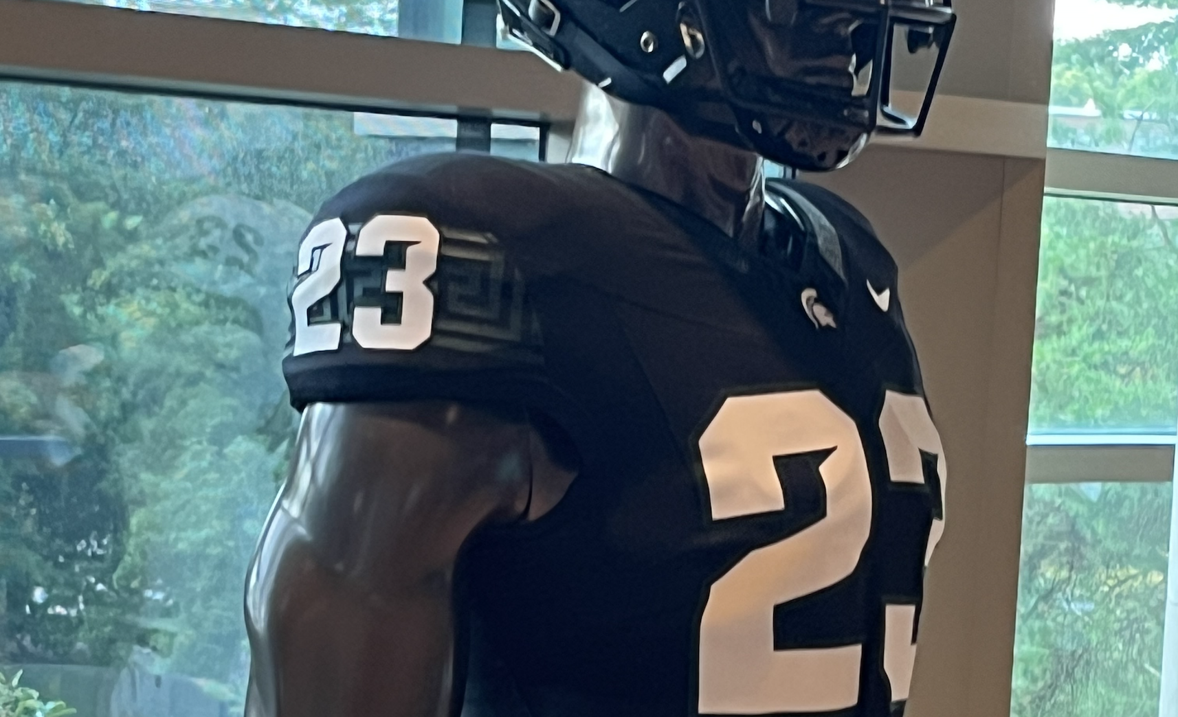
Michigan State football unveiled uniforms and they’ve received rave reviews. Here are my honest thoughts on the new look.
For weeks, Michigan State football has been teasing an announcement on July 28. As it turns out, the secret was related to uniforms. On Friday evening, Michigan State unveiled a new set of uniforms for the 2023 season.
The Spartans showcased three different combinations, each featuring a different color. They’ll have the traditional green and white combinations that we’ve seen since 2017. New this year are the “Shadows” themed black uniforms named after Michigan State’s alma mater.
The uniforms have received generally positive feedback online so far. Afterall, the Spartans are blessed with an exceptional color combination and logo. The dark green contrast with white always looks crisp. The Spartan head logo is ideal for a football helmet. It’s not too tall or too wide, and it looks tremendous on both sides of the helmet. Beyond that, there are some details that are worth discussing. It’s been noted that Michigan State will mix and match the helmet, jersey, and pants.
For simplicity with this review, we’ll review the uniforms as presented on Friday. The grading scale will be a simple 1-10.
All-green uniform
The green uniform looks fairly similar to the ones we’ve seen since 2015. The green helmet has a matte finish with a white facemask. The “Michigan State” lettering and font at the top of the jersey remains the same as well. The most notable change is the introduction of the Greek themed stripe throughout the uniform set. I’m not a big fan of this stripe in general. I don’t think it looks good on the basketball uniforms, and I don’t think it looks good here either.
It’s tolerable on the jersey sleeves and the pants because it’s green and blends in with the fabric. Even there though, the shade of green is slightly lighter, creating an almost shiny effect that looks funky. On the collar, it’s better because it’s very thin. You don’t notice it until you’re up close. On the helmet, it’s too thick. It draws your attention away from the spartan head logo and makes the helmet feel too busy.
“Clean” uniforms have straight, simple, and crisp lines. This jagged, swirly pattern is the complete opposite of that. On TV or in the stands, it will probably look like a solid stripe. It’s not enough of a negative for me to say that it ruins the uniform. MSU should maintain the ability to mix all three elements with the white uniform set to form exceptional combinations.
Overall, it’s nice, but not earth shattering. I hope they phase the Greek stripe out in favor of a thin, solid stripe that we’ve seen in the past.
Score: 7/10
All-white uniform
When the white helmets were first released in 2017, I loved them. I thought they were the perfect alternative to wear 2-3 times a season. What I didn’t know was that the Spartans would wear them just as often as they wore the traditional green helmets. It also didn’t help that outside of the 2017 win against Michigan, the Spartans almost never won while wearing them. I grew to resent them.
Here though, I think these are far and away my favorite set.
The Greek stripe on the jersey sleeves and pants is also white, creating a subtle variation to an otherwise very simple combination. It should be noted that all three uniforms are cut from the new Nike uniform template that will also be worn in the NFL this season. It’s most noticeable on the white set, which brings a sleek and modern feel.
As for the helmet, I think this is the version where the Greek stripe plays the best. The white helmet and white facemask on its own are extremely basic. The Spartan logo and stripe provide just enough detail to avoid the ever popular “storm trooper” look. Once again, the clean and fresh white fabric makes the green font really pop. These are almost identical to the white set that has been worn for years. But hey, if it ain’t broke, don’t fix it. These should look great for years to come.
Score: 8/10
All-black uniform
The green and white sets of uniforms presented very minor tweaks to the Spartan classics.
The new “Shadows” themed black set is entirely new. I’m sure the Spartans will be eager to wear them, so we’ll probably get multiple looks at them this season. Let’s start with the positives. The jerseys are really cool. I love the elimination of “Michigan State” across the front for an alternative. The white spartan head on the collar looks incredibly crisp against the black, making it easy to identify as a Michigan State jersey. The green striping blends in pretty well with the black, maintaining that theme across the set without being an overpowering presence.
As simple as it sounds, Nike did the right thing by going with white font for the numbers and nameplates. They didn’t try to mess around with green or silver. White is simple, legible, and classic. I also love the detail on the helmets. There appears to be some sort of special paint specks engrained throughout the helmet. This should look radiant under the lights.
In general, though, I’m not a fan of this combination. I understand why MSU introduced them. Black uniforms matter to recruits, players, and fans. But I’m a traditionalist. Black is not an official color of Michigan State University. The fight song states, “fight for the only colors… green and white”. Throwing black into the color scheme is a popular move amongst a lot of schools. I took pride in the fact that Michigan State was one of the schools to resist that urge.
As for the uniforms themselves, my main gripe is with the helmet. As mentioned earlier, the white accent on the black looks the best. The green decals and stripe don’t stand out enough against the black. It also creates some inconsistency throughout the set with white letters and numbers. A white Spartan decal would have made the team easier to identify from a distance while maintaining a two toned color scheme. I fear what they’ll do with the black set in combination with the green and white pieces.
On its own, the all black looks good. Combined with white and/or green, I don’t feel the same way. All in all, the uniform is cool. I can see why people like them. But I think they’ll grow old quickly if MSU wears them too often.
The traditionalist in me doesn’t think of Michigan State when I see them. Go green. Go white.
Score: 5/10

 FOOTBALL2 weeks ago

 FOOTBALL4 days ago
 BASKETBALL2 weeks ago
 BASKETBALL6 days ago

 FOOTBALL1 week ago

 BASKETBALL6 days ago
 MORE SPORTS6 days ago
 MORE SPORTS6 days ago
