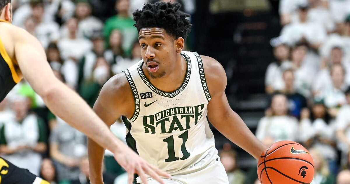
Michigan State basketball has a plethora of alternate jerseys to go along with the regulars. What are the top five looks?
It’s been a long week for Michigan State basketball fans. We had to suffer the tough loss to Purdue on Sunday, and now have to wait until Saturday for our next game.
While it’s nice to have the distraction of National Signing Day for football, I’m itching to see our Spartans back on the hardwood.
These day dreams got me thinking about all the uniforms that we’ve had in the last 25 years, and we should consider ourselves lucky that we’ve had some pretty awesome jerseys. Nike has done an awesome job (for the most part) of providing top tier threads and that is a big recruiting pitch for high school talent.
And here are my top five jerseys for MSU hoops.
Honorable mentions
MAC jerseys: I love a good throwback, but not many Spartan alum want to claim Michigan Agriculture College. I’m fine with it as a one-off, but let’s leave it in the past.
Camo: I love that Izzo and the university are arranging games like the Carrier Classic. It gives us a national spotlight and it’s an experience that people will remember for years to come. Not to mention, we get a cool, military themed jersey with it.
PK80: Nike made us an alternate football jersey during the Kirk Cousins era that incorporated bronze into our uni. I actually loved it even though it was very different. For the PK80 tournament, Nike used that as inspiration and I thought did a very good job with it.
Black/Neon: I’m all about following the trends, and Nike has tried to incorporate neon into many teams over the last handful of years. I’m young enough to appreciate the neon lettering, but old enough to say that we should stick to the “only colors”
Dishonorable mentions
Highlighter neon: Sometimes Nike goes too far with their neon (insert neon football jersey joke here), and they did it again with these neon green greens with a slight dark green ombre on the shorts. The players actually seemed to like them at the time, but I hope we keep those in the uniform closet.
STATE/Gruff Sparty: I want to preface this by saying I love Gruff Sparty. I think he’s a top five logo in college sports, and I love when MSU uses him. I also love when we use the Greek key on the side. My issue is with the “STATE” across the front. It’s kind of our font, but kind of not. I also don’t like the attempt of making the letters connect. The other issue I have is the lack of symmetry. I think if you’re using the Gruff Sparty, forget the Greek key or vice versa.
5. 2005 Final Four Team
I may be biased because this Final Four team was the team that fueled my passion for Michigan State basketball. There are so many good memories watching this team, and I still have this jersey in my closet. I liked the unique “State” across the front, and it just had a swagger to it (probably because of Shannon Brown and Mo Ager). I did not like when they extended the shoulders during the Drew Neitzel era. I hope these make a comeback like some other retro jerseys from our past.
4. Magic era script
I can be a sucker for a classic uniform, and this is the definition of a classic. One of the treasured seasons of MSU’s history just happened to have one of the cleanest uniforms. My only gripe, and the reason it’s at #4 is the oversized yellow basketball on one side of the shorts. I know it’s the same as they used during the 79 season, but we’ve modified classic jerseys before. No one needs to see a tennis ball on the basketball court.
3. Black on black
Debuting last year, I was/am a huge fan of these. I love the simplicity of having the Spartan head on the front, along with the clean Greek key along the sides. You start to see more teams doing the black on black or white on white, and I love that we jumped on the trend.
2. Modern ‘Spartans’
One underrated aspect to our Spartan brand is the font that we use. Not many schools could you pick out the lettering and claim it as their own. I love the clean “SPARTANS” across the front with the simple design. It is our most used jersey since 2016, and it should be.
1. Flintstones
Maybe it’s the nostalgia of Izzo’s first championship, but I absolutely love these jerseys. It’s unique with the logo on the front, as well as the debut of using the Greek key border design. We finally brought them back a few years ago, but I would love to see us try a green away version. Pair these with the Iverson “Question” shoes, and you got yourself a championship look.
Feel free to sound off in the comments or on social media your thoughts.